23 Wedding Color Palette Ideas 2026
Your wedding day serves as a massive canvas for your personal style. Choosing the right vibes takes effort, so I curated these 23 Wedding Color Palette Ideas 2026 to help you decide. Whether you love bold splashes or muted neutrals, these upcoming trends offer something truly spectacular.
Island Citrus Bliss

You should definitely look at Island Citrus if you want an optimistic vibe for a spring or summer celebration.
This vibrant yellow green shade claims the title of the 2026 Wedding Color of the Year for good reason.
I suggest pairing it with cream, soft gold, and white to keep things refined.
You can infuse this zesty energy into your cocktails, stationery, and ceremony arches.
It brings a fresh energy straight from the runway to your floral arrangements.
Mocha Mousse Elegance

Warm mocha mousse creates a sophisticated, earthy atmosphere that feels incredibly cozy.
Think of it as the new black for 2026.
You can use chocolate brown, latte beige, and ivory to achieve a residential aesthetic.
This palette works beautifully for bridesmaid dresses and layered linens.
I recommend adding gold metallic accents to provide depth and luxury.
It grounds your event in a way that feels both timeless and modern for any season.
Juicy Red Passion

Juicy red makes a passionate statement that builds on the recent popularity of bold primary colors.
You can pair this watermelon or poppy red with neutrals or soft pinks to balance the intensity.
I love seeing these pops of color in glassware and floral installations.
It symbolizes love and luck, making it a natural choice for a romantic vineyard wedding.
Do not feel afraid to go bold with your lipstick or shoe choices to match.
Blush Pink Romance

Blush pink remains a romantic mainstay because it offers such a gentle, feminine appeal.
You can combine it with brown or rose for a 2026 twist that feels fresh rather than dated.
I suggest using it for your bouquets and reception details to create a cohesive, dreamy atmosphere.
This palette works across all four seasons without ever feeling out of place.
It provides a soft backdrop that allows your other design elements to shine brightly.
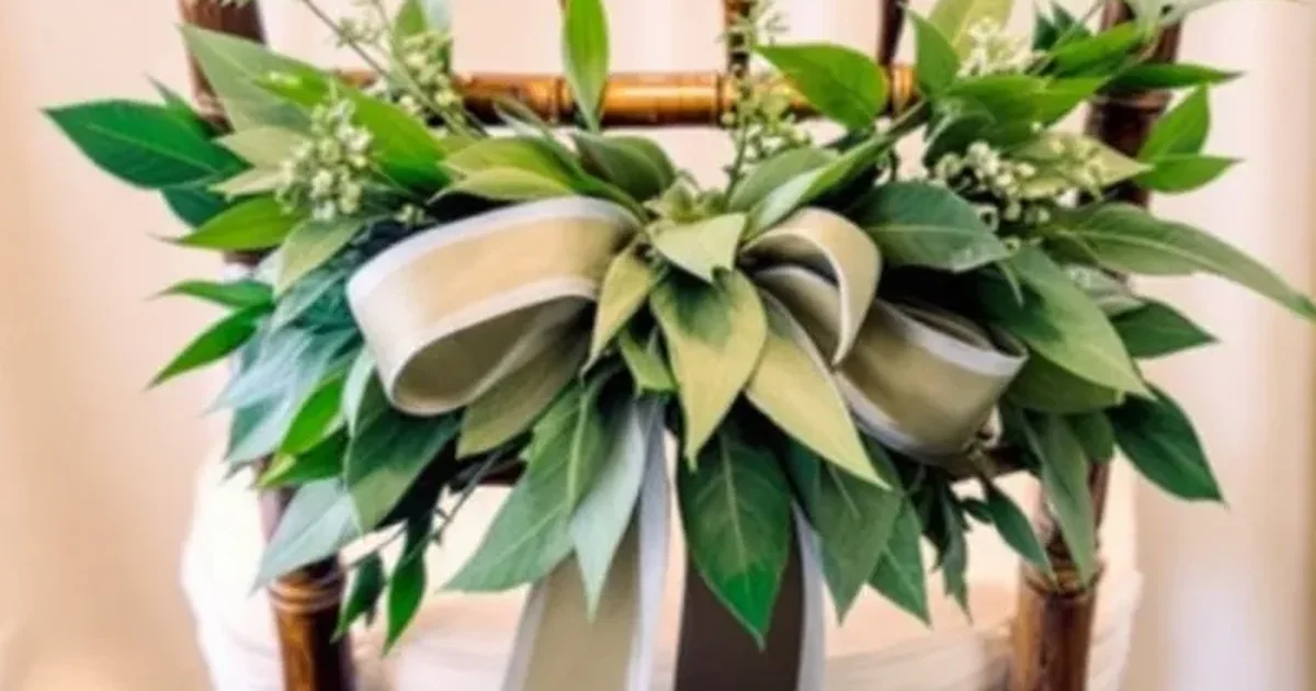
Sage Green Serenity

Sage green provides a calming, nature inspired look that is perfect for a boho garden wedding.
Use ivory, cream, and subtle pinks to complement this versatile, muted green.
You can easily incorporate this into your signage and linens for a serene feeling.
Mismatched bridesmaid attire in various green shades looks particularly stunning in photos.
I think eucalyptus heavy florals allow you to bring the outdoors inside for a very fresh, organic vibe.
Lavender Haze Dream

Lavender haze creates an ethereal, storybook charm that belongs in a fantasy setting.
You can blend pink, violet, blue, and green to achieve this whimsical pastel scheme.
This palette photographs beautifully, especially during outdoor spring ceremonies.
I recommend layering your florals to give the decor a textured, multidimensional look.
It offers a playful yet sophisticated alternative to traditional wedding colors.
Your guests will feel as though they entered a magical garden dream world.
Butter Yellow Sunshine

Butter yellow brings a sunny optimism to your summer wedding day.
You can pair this creamy shade with peach or olive for a vintage inspired glow.
I see this color trending heavily for bridesmaid gowns and table settings.
It adds a joyful brightness without the harshness of a true neon yellow.
Marigold florals look spectacular when tucked into bouquets or used in centerpieces.
It makes every guest feel like they are basking in pure sunshine.
Cobalt Blue Depth

Cobalt blue offers a modern, luxurious depth that works perfectly in contemporary venues like lofts or lakefronts.
You can pair it with silver or earth tones to create a sexy, unified look.
I think this blue looks incredible when used in large scale textiles or ceremony backdrops.
It adds a sense of drama that lighter blues simply cannot match.
Cobalt serves as a powerful anchor for your entire design.
It brings a sophisticated edge to a classic wedding color.
Sunset Glow Radiance

Sunset glow captures the magic of the golden hour through layered pinks, oranges, and yellows.
This palette feels effortless and warm, which is perfect for an outdoor summer event.
I recommend using chiffon fabrics to catch the light and enhance the radiant vibe.
You can mix and match these hues in your bridesmaid dresses for a modern look.
It creates a natural, glowing atmosphere that feels incredibly romantic.
Your photos will look absolutely luminous with these warm tones.
Earthy Brown Warmth

Earthy brown tones like espresso and portobello offer a grounded, sophisticated alternative to black.
You can use these tonal browns with cream to achieve a moody, interior inspired trend.
I like the look of monochromatic linens paired with rich, textured florals.
This scheme brings a residential elegance to any venue, making the space feel more intimate.
It works well for autumn weddings but carries enough weight for a formal winter celebration as well.
It is truly a refined choice.
Powder Blue Whimsy

Powder blue evokes a sense of nostalgic romance and calming versatility.
You can pair it with blush or silver for a dreamy spring aesthetic.
This palette feels especially at home in a New England summer or a coastal setting.
I suggest using it for your stationery and cake designs to maintain a light, airy feel.
It creates a harmonious atmosphere that is very easy on the eyes.
This shade offers a timeless quality that you will love for decades.
Fuchsia Fiesta Burst

Fuchsia, orange, and light blue create a daring trio that brings playful sophistication to your summer wedding.
This vivid contrast ensures your celebration stands out from the crowd.
I recommend using these colors for your invitations to set an energetic tone early on.
The combination feels festive and bright, perfect for a high energy reception.
You can use these shades in your florals to create a centerpiece that guests will talk about all night.
It is pure fun.
Lilac Peach Magic

Lilac and peach mingle together to create an enchanting, fairy tale vibe for your ceremony.
This palette blends soft purples with warm fuzz for a whimsical 2026 appeal.
I love seeing these colors mixed within bouquets and bridal party attire.
It offers a fresh take on traditional garden colors without feeling too predictable.
Use these tones to craft a sense of wonder and joy throughout your venue.
This combination feels light, romantic, and perfectly suited for a spring day.
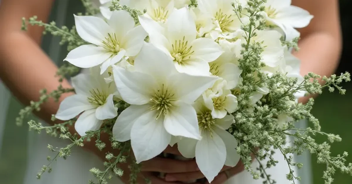
Eucalyptus Nature Calm

Eucalyptus green provides a grounded, organic palette for couples who love nature.
You can pair this soft green with neutrals or a pop of coral for extra warmth.
I suggest using textured linens and lush greenery to emphasize the calming elegance of this scheme.
It feels effortless and harmonious, especially for an outdoor or glass house venue.
Subtle bridal details in this shade look incredibly sophisticated.
It is a great way to bring a peaceful energy to your big day.
Portofino Orange Zest

Portofino orange brings a bold, happy warmth that you should use sparingly for maximum impact.
You can pair it with citrine or neutrals to keep the look sophisticated rather than overwhelming.
I recommend using this zest in your cocktails, floral accents, and table stationery.
It adds a celebratory energy that feels very natural and bright.
This color works wonders for a summer wedding in a sun drenched location.
It is a small way to add a massive amount of personality.
Chocolate Fondant Indulgence

Chocolate fondant browns offer an indulgent warmth that feels very luxurious.
You can combine this rich shade with blush, purple, or gold for a grounded yet decadent palette.
I love using these tones for your dessert displays and silk linens.
It creates a cozy atmosphere that invites guests to relax and enjoy the celebration.
This scheme works beautifully for a winter wedding where you want to emphasize comfort and elegance.
It feels very high end and unique.
Hunter Green Classic

Hunter green serves as an evolved version of the classic black and white scheme.
You can use this deep green with earthy neutrals to create a mistake proof design.
I suggest replacing traditional black elements, like tuxedos or signage, with this rich forest shade.
It adds a seasonal depth that works from pistachio all the way to kelly green.
Mossy decor and velvet textures help emphasize the natural elegance of this choice.
It provides a timeless look that feels very regal.
Peach Fuzz Softness

Peach fuzz offers an ethereal warmth that is perfect for a whimsical spring or summer wedding.
You can pair it with soft pinks or mint green for a luminous, romantic feel.
I love this color for bridesmaid dresses because it flatters a wide range of skin tones.
Use it in your florals and subtle accents to create a dreamy, timeless celebration.
It feels light and airy, like a soft summer breeze.
This palette ensures your wedding feels incredibly gentle and welcoming.
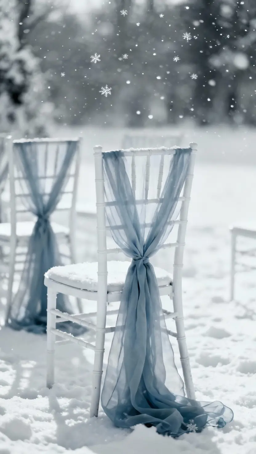
Sky Blue Serenity

Sky blue brings a modern airiness to coastal or outdoor weddings.
You can pair it with dreamy neutrals to maintain a serene and calm atmosphere.
This color is incredibly easy to coordinate across your florals, dresses, and stationery.
I think it looks best when the design remains simple and uncluttered.
It helps create a sense of romance that feels both fresh and traditional.
Your guests will appreciate the tranquil vibe this palette provides during your vows and reception.
Storm Gray Moody

Storm gray blue offers a sophisticated, contemporary drama that is perfect for industrial spaces.
You can use this moody neutral to add subtle depth to your textiles and backdrops.
I recommend pairing it with cool whites or silvers for a sharp contrast.
This palette feels very edgy and modern without being too dark or heavy.
It provides a perfect canvas for unique lighting designs.
If you want a wedding that looks like a high fashion editorial, this is your color.
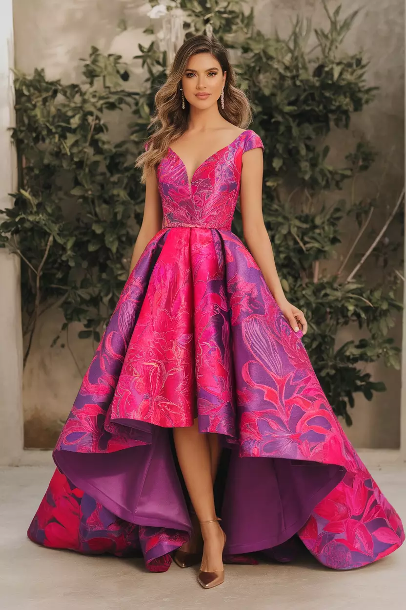
Royal Purple Regal

Royal purple brings a daring, luxurious sophistication to your wedding palette.
You can pair this jewel tone with chocolate or ivory to elevate the sense of old world opulence.
I love seeing this depth in floral arrangements and bridesmaid dresses.
It adds a lot of personality and weight to your design, making it feel very regal.
This color choice shows that you are not afraid to be bold and elegant at the same time.
It is a truly grand selection.
Fresh Lime Energy

Fresh lime green yellow provides a playful, modern energy that works well as a pop of color.
You can pair it with whites or other jewel tones to keep the look balanced.
I suggest using this shade in your cake design, draping, or small accessories.
it adds a lively spark that keeps the atmosphere feeling energized and current.
This palette is for the couple that wants to avoid the traditional and embrace something totally unique.
It is undeniably fresh.
Vanilla Cream Timeless

Vanilla cream concludes our list as a soft, romantic backdrop that never goes out of style.
You can use it with metallics or bold florals for a refined, minimalist look.
I recommend varying your textures to keep this monochrome palette from feeling flat.
Layered neutrals in your linens and cakes create a sense of understated elegance.
This choice allows your venue and your own presence to take center stage.
It is a sophisticated, clean way to end your wedding design journey.