How to Pick Wedding Colors: Choosing that Perfect Color Palette
Picking wedding colors feels like a big puzzle. You want something beautiful, timeless, but also uniquely you. Relax, because I am here to share all my secrets, the good, the bad, and the slightly absurd, about choosing that perfect palette. It is easier than you think, I promise!
Start with What You Love
Forget what the latest wedding magazine says. Your wedding, your rules. I always tell my friends to begin with things they already adore. Do you love bright, bold hues or soft, muted tones?
Your Personal Style is Key
Think about your closet. What colors fill it? If your wardrobe is a rainbow of vibrant jewel tones, suddenly choosing an all-white wedding might feel a little… off. If your home decor screams minimalist neutrals, embracing a fiesta theme could be a shock to your system.
I remember one bride, Sarah, just loved blue. Not just any blue, but a deep, inky navy. Her fiancé, Mark, was a sports fanatic, and their team colors happened to be navy and gold. They blended her love for the color with his passion, and it looked spectacular. It genuinely felt like them.
Consider Your Favorite Season
The time of year you get married plays a huge role in color selection. Certain colors just feel right for certain seasons. Spring often whispers pastels, while fall calls for richer, cozier shades.
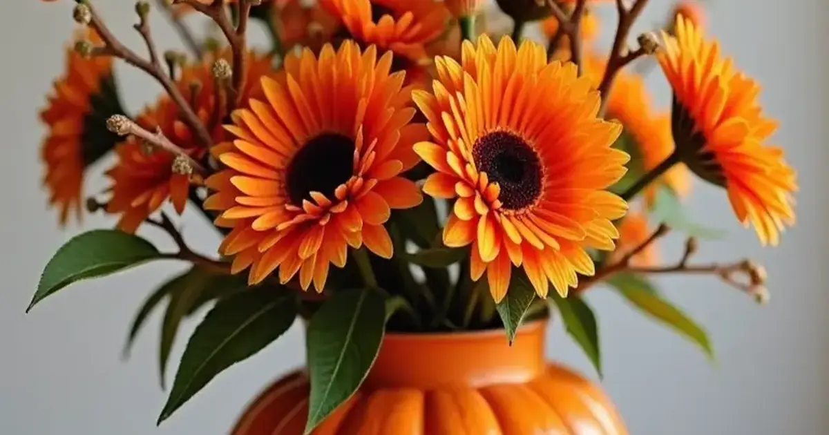
- Spring: Think blush pink, mint green, lavender, light blue, soft yellow. These colors feel fresh and new, just like spring flowers.
- Summer: Bright fuchsia, vibrant coral, turquoise, sunny yellow, crisp white. These colors evoke warmth and energy, perfect for a lively celebration.
- Autumn: Deep burgundy, burnt orange, forest green, rustic gold, chocolate brown. These colors mirror the changing leaves and cozy vibes of fall.
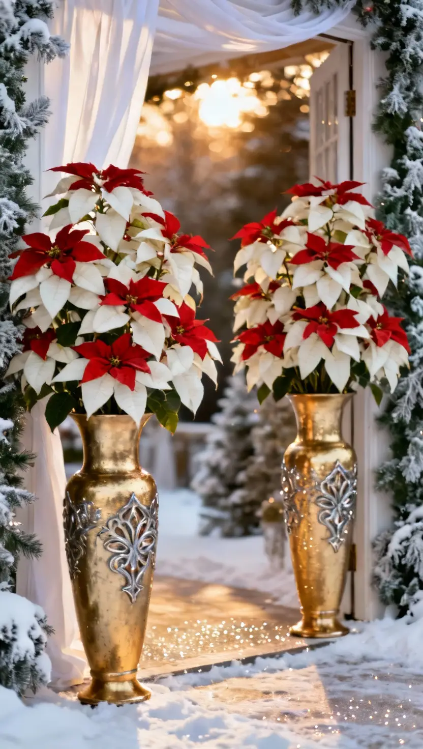
- Winter: Icy blue, silver, deep plum, emerald green, cranberry, classic white and gold. These colors bring a touch of elegance and warmth to colder months.
Venue Vibe Matters
Does your venue have a distinct personality or existing decor? You do not want your chosen colors to clash with the permanent fixtures. Imagine trying to force bright pink into a rustic barn with exposed wood and vintage tractors. It just does not work.
I once saw a couple try to make a very modern, industrial loft space work with a super bohemian color scheme. The mismatched vibes felt jarring, like a confused fashion choice. Always visit your venue first and really look at its inherent colors and style. Are the walls a specific shade? Is the flooring patterned? Does it have a lot of natural light?
Working with Existing Decor
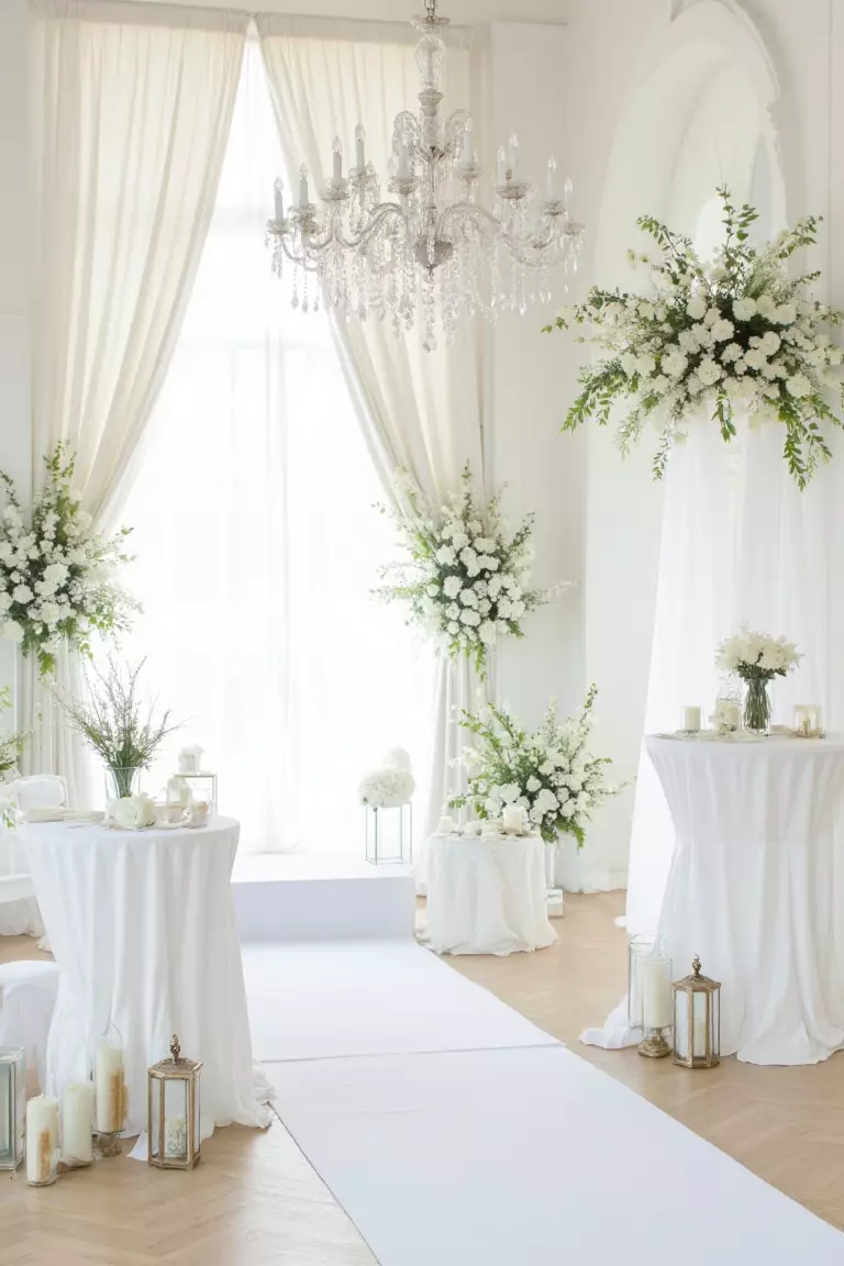
If your venue features grand chandeliers and velvet drapes, embrace that elegance. Jewel tones or classic metallics will shine. If it is a casual beachside spot, lean into ocean-inspired hues. Do not fight the inherent beauty of your space; complement it.
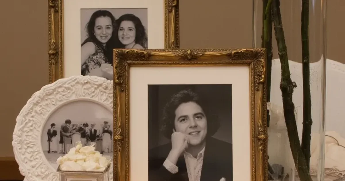
The Dress and Attire
This might seem obvious, but your wedding dress, and the bridal party attire, heavily influence your color scheme. The dress color itself, whether it is stark white, ivory, champagne, or something else entirely, sets a foundation.
Coordinating with Your Gown
If your gown is a warm ivory, a cool icy blue might look a little off against it. Champagne dresses pair beautifully with blush or gold tones. Consider the undertones of your dress fabric. Are they warm or cool?
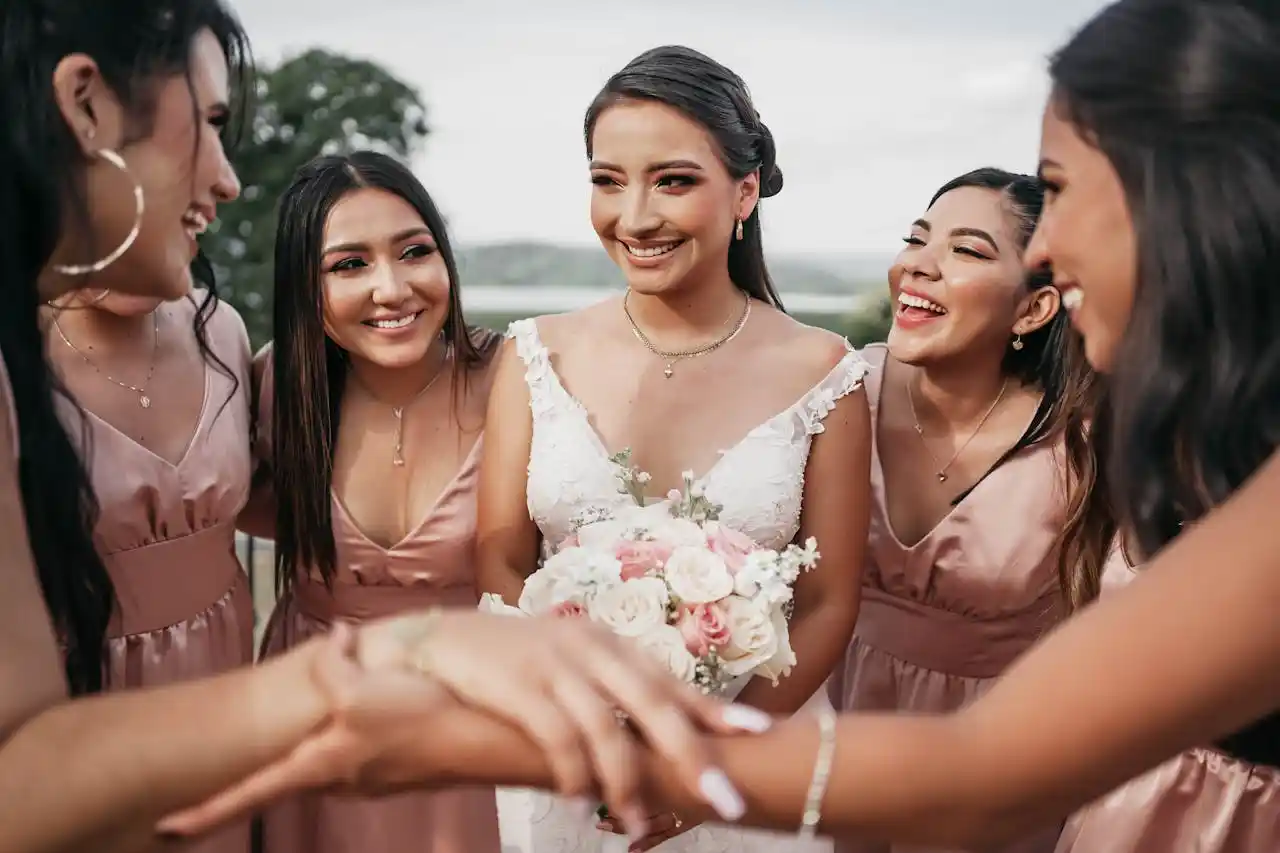
Then there are the bridesmaids and groomsmen. Their outfits will feature prominently in all your photos. You want the colors you pick to flatter everyone involved. Some colors, bless their hearts, just do not look good on a wide range of skin tones. A good trick is to choose a neutral that almost everyone looks good in, like navy or charcoal, and then use your accent colors for flowers and decor.
I had a friend who picked a truly unfortunate shade of chartreuse for her bridesmaids. Let me tell you, those poor women looked like they had a severe case of seasickness. Learn from her mistakes. Sample colors on different skin tones if you can.
Consider the Overall Mood
What feeling do you want to create on your wedding day? Do you dream of a romantic, intimate affair or a lively, festive party? Your colors communicate this mood before you even say “I do.”
Mood Board Magic
Creating a mood board, even a digital one on Pinterest, helps immensely. Collect images that evoke the feeling you want: flowers, art, fashion, even landscapes. You will start to see patterns in the colors that appeal to you. This is less about specific shades and more about the overall palette and vibe.
A soft, ethereal vibe usually calls for muted pastels and whites. A glamorous, formal event might use metallics, deep jewel tones, and classic black and white. A fun, whimsical celebration could incorporate bright, playful colors.
For my sister’s wedding, she wanted it to feel like a big, joyful garden party. We went with a mix of vibrant pinks, oranges, and yellows, with plenty of lush greenery. The colors made everyone feel happy and ready to celebrate.
The Color Wheel is Your Friend
Remember that basic color wheel from art class? It is actually super useful for wedding planning. You do not need to be an artist, just know a few simple combinations.
Here are some basic color harmonies that always work:
- Monochromatic: Different shades and tints of a single color. Think various shades of blue, from sky blue to navy. This creates a really sophisticated, cohesive look.
- Analogous: Colors next to each other on the color wheel. Like blue, blue-green, and green. This gives a harmonious, relaxed feel.
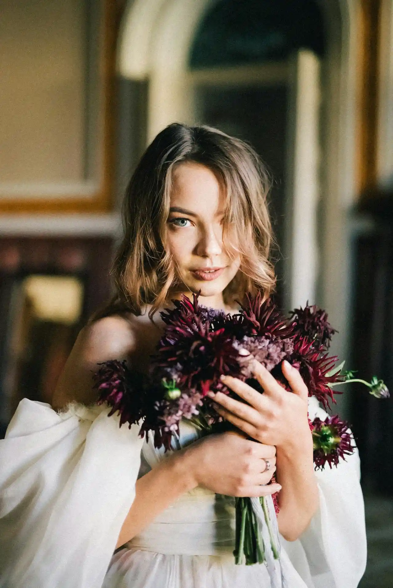
- Complementary: Colors opposite each other on the color wheel. Red and green, blue and orange, yellow and purple. These create high contrast and a vibrant, energetic feel. Use one as the main color and the other as an accent.
- Triadic: Three colors equally spaced on the color wheel. For example, red, yellow, and blue. This creates a bold, balanced, and sometimes playful look.
Using Neutrals and Metallics
Neutrals like ivory, white, beige, grey, and black are your best friends. They provide a grounding base for your main colors. Metallics such as gold, silver, rose gold, and copper add sparkle and sophistication. They do not count as a “main” color but rather as an accent.
I suggest picking a main color, one or two accent colors, and a neutral. A metallic can be your fourth “color” if you like sparkle.
| Category | Description | Example Color Combinations |
|---|---|---|
| Primary Color | Your dominant color, often seen first. | Navy Blue, Emerald Green, Blush Pink |
| Secondary Colors | One or two colors that complement your primary. | Navy + Gold + Ivory; Emerald + Champagne + Cream |
| Accent Colors | Small pops of color, used sparingly for detail. | Navy/Gold/Ivory + a touch of Coral; Emerald/Champagne/Cream + a hint of Plum |
| Neutrals | Backbone colors that ground your palette. | White, Ivory, Beige, Gray, Black |
| Metallics | Add shine and texture. Use as an accent. | Gold, Silver, Rose Gold, Copper |
Test Your Colors
Once you narrow down your choices, get actual swatches. Do not just look at images on a screen; colors appear differently in real life. Look at them in different lighting conditions: natural daylight, indoor lighting, evening light. A color that looks amazing in bright sunshine might appear dull under dim reception lights.
Fabric Swatches are a Must
Grab fabric swatches from your bridesmaid dress options, linen samples, even paint chips. See how they interact. My most embarrassing moment involved picking a lovely soft grey for tablecloths, but under the venue’s yellowish lighting, it turned a distinct shade of dingy beige. Live and learn, my friends, live and learn.
Do Not Overdo It
More than three primary colors usually just looks messy. Stick to a main color, maybe one or two complementary colors, a neutral, and an optional metallic. Simplicity often speaks volumes more than a rainbow explosion.
Less is Sometimes More
You want your decor to feel cohesive, not chaotic. Every element does not need to be a different color. Use different shades and tints of your chosen colors to add depth and interest without adding more colors to the palette.
For instance, if your main color is blush, use dusty rose, deeper rose, and pale pink instead of throwing in an entirely new color. This creates a rich, layered look.
Final Thoughts on Wedding Color Palettes
Remember, this is your day. The colors you choose should make you happy. Do not get stressed trying to find the “perfect” combination. If you love it, that is all that matters.
I hope these tips help you navigate the wonderful world of wedding colors. Have fun with it. It is your big day, so choose colors that make your heart sing!
Frequently Asked Questions About Choosing Wedding Colors
What is the most popular wedding color palette?
While trends come and go, classic combinations like blush and gold, or navy and white, remain consistently popular. These offer a timeless elegance many couples seek for their special day.
How many colors should I pick for my wedding?
I recommend choosing a core of one to three main colors, along with a neutral like ivory or gray, and a metallic for accent. This creates a cohesive and balanced look without overwhelming the eye.
Should my wedding colors match my venue?
You do not need to perfectly match, but your wedding colors should definitely complement your venue’s existing decor and aesthetic. Choosing colors that harmonize with the space creates a more unified and visually pleasing atmosphere.